- Double Your Data with AT&T
- Posted on October 9, 2014 | Comments Take advantage of AT&T's latest promotion til' the end of October 2014.
the Blog
What is Responsive Web Design?
Posted on May 23, 2012 by Michael Rosario | Comments
Responsive web design is a new approach in which a site would appear flexible aka "responsive" as it automatically adjusts to your screen size, browser platform, and/or screen resolution. Before responsive design/development, we had something close — the ability to serve targeted CSS stylesheets for mobile, screen, and print - three separate stylesheets!
Remember these?
<link rel="stylesheet" type="text/css" href="reset.css" media="all" />
<link rel="stylesheet" type="text/css" href="mobile.css" media="handheld" />
<link rel="stylesheet" type="text/css" href="screen.css" media="screen" />
<link rel="stylesheet" type="text/css" href="print.css" media="print" />
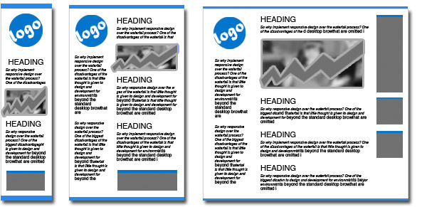
Responsive websites show the same content - but rearranged to maximize the use of the space allowed by your browser or screen using media queries. See example below, let's say – iphone screen, ipad screen, and LCD screen:

/* CSS for all browser goes here */
@media only screen and (max-width: 900px) {
/* CSS for browser screen with 900px and below goes here */
}

@media only screen and (max-width: 600px) {
/* CSS for browser screen with 600px and below goes here */
}
For more information here are a few helpful resources:
- Bye, Bye Waterfall: 5 Steps to Implement Responsive Web Design
- HTML5 - Responsive Web Design
- What The Heck Is Responsive Web Design?
Books to Read:
- A Book Apart: Responsive Web Design by Ethan Marcotte
- Responsive Web Design with HTML5 and CSS3 by Ben Frain
Cool Frameworks/Boilerplates:
comments powered by Disqus
Other Recent Blog
- Microsoft releases the Latest Internet Explorer Browser, Time to Update!
- Posted on June 17, 2014 | Comments The much anticipated version of IE was just released on 06/16 after the government urged users not to use it until a patch was added last April.
- Let’s go Phishing!
- Posted on May 15, 2014 | Comments Actually, let's not. No fish here. It's an online form of identity theft. According to Wikipedia, phishing is an act of attempting to acquire sensitive information such as usernames, passwords, social security numbers, and credit card details by masquerading as a trustworthy entity in an electronic communication.
- Windows XP is Expiring on April 8
- Posted on April 3, 2014 | Comments If you recently received a notification that your Windows XP is expiring, have no fear?