- Let’s get minified - Compressing and Optimizing your Code.
- Posted on July 14, 2011 | Comments I love javascript and I end up using 1,2,3...8 scripts on a site. It comes to a point that all these small file sizes add up.
the Blog
What is Responsive Web Design?
Posted on May 23, 2012 by Michael Rosario | Comments
Responsive web design is a new approach in which a site would appear flexible aka "responsive" as it automatically adjusts to your screen size, browser platform, and/or screen resolution. Before responsive design/development, we had something close — the ability to serve targeted CSS stylesheets for mobile, screen, and print - three separate stylesheets!
Remember these?
<link rel="stylesheet" type="text/css" href="reset.css" media="all" />
<link rel="stylesheet" type="text/css" href="mobile.css" media="handheld" />
<link rel="stylesheet" type="text/css" href="screen.css" media="screen" />
<link rel="stylesheet" type="text/css" href="print.css" media="print" />
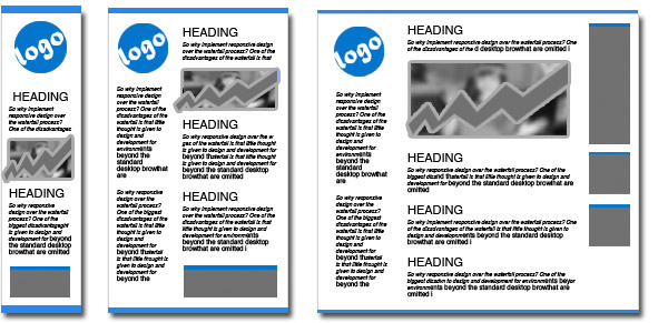
Responsive websites show the same content - but rearranged to maximize the use of the space allowed by your browser or screen using media queries. See example below, let's say – iphone screen, ipad screen, and LCD screen:
/* CSS for all browser goes here */
@media only screen and (max-width: 900px) {
/* CSS for browser screen with 900px and below goes here */
}

@media only screen and (max-width: 600px) {
/* CSS for browser screen with 600px and below goes here */
}
For more information here are a few helpful resources:
- Bye, Bye Waterfall: 5 Steps to Implement Responsive Web Design
- HTML5 - Responsive Web Design
- What The Heck Is Responsive Web Design?
Books to Read:
- A Book Apart: Responsive Web Design by Ethan Marcotte
- Responsive Web Design with HTML5 and CSS3 by Ben Frain
Cool Frameworks/Boilerplates:
comments powered by Disqus
Other Recent Blog
- Mobile App Development with jQuery
- Posted on May 26, 2011 | Comments This is just a personal experience making a mobile app with jQuery for the iPhone. It's unbelievably easy!
- Getting Your Next iPhone for FREE
- Posted on May 15, 2011 | Comments I'm just sharing my experience in selling my previous iphone to get the most recent iphone. I love my iphone and i'm sure you love yours too.
- Show Some Web Typography Love Using Typekit
- Posted on May 12, 2011 | Comments Typekit is a simple add-on to your site that allows the use of custom fonts. They have hundreds in their library. It's simple, light-weight, and compatible to most browsers.